
Brand strategy · Character design · Website
Insurance
with Jay.
A hands-on brand for
hands-on businesses.
 Built around the working day.
A new brand and website for an independent Ontario insurance broker who works with the trades. We brought Jay’s personal approach into the positioning, language, characters, and digital experience—connecting everyday working situations to a clear invitation to check your cover.
- Client
- Insurance with Jay · Ontario, Canada
- Our role
- Strategy, identity, illustration direction, copy & development
- Scope
- Bilingual website, 15 trade pages & a growing character system
- Built with
- HTML · CSS · JavaScript · AI-assisted illustration
01 The brief
Start with the work. Make the advice personal.
Jay’s audience has practical questions: are the tools in the van covered, will a certificate arrive before a job starts, and does an old policy still fit a growing crew? The brief was to build a new brand around those conversations. Jay’s experience with manual work and his long career in insurance shaped the direction: a broker who understands the working day, explains the details, and stays within reach when something changes.
02 The identity
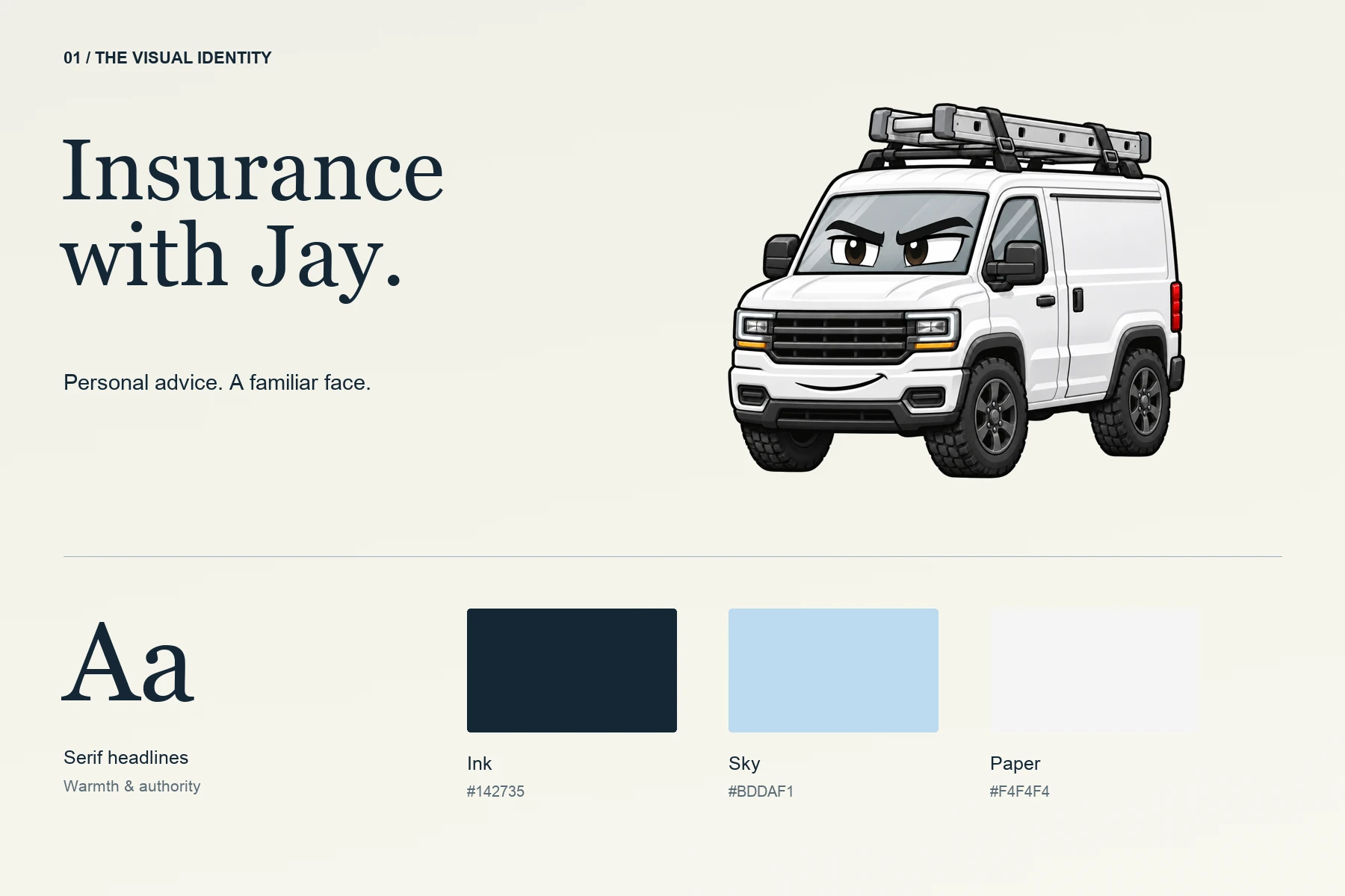
An identity with warmth and authority.
The visual language pairs substantial serif headlines with simple interface typography, open space, and a pale blue palette. Technical house drawings anchor the brand in the world of the trades. The writing uses Jay’s own point of view and names specific situations—new vans, bigger jobs, missing paperwork—so the message feels like the start of a useful conversation.
03 The characters
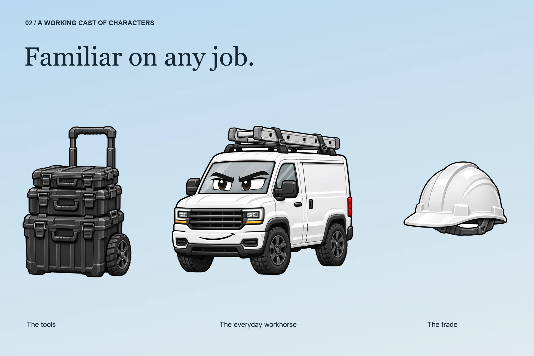
A familiar face, with room to grow.
The work van became the lead character because it belongs in the daily life of the people Jay helps. Its expression brings personality to a category that can feel distant. A toolbox, hardhat, and supporting equipment expand that world, while consistent outlines, proportions, and shading keep the illustrations related. The character system gives the website a recognizable voice and creates a foundation for future explainers and campaigns.
04 The website
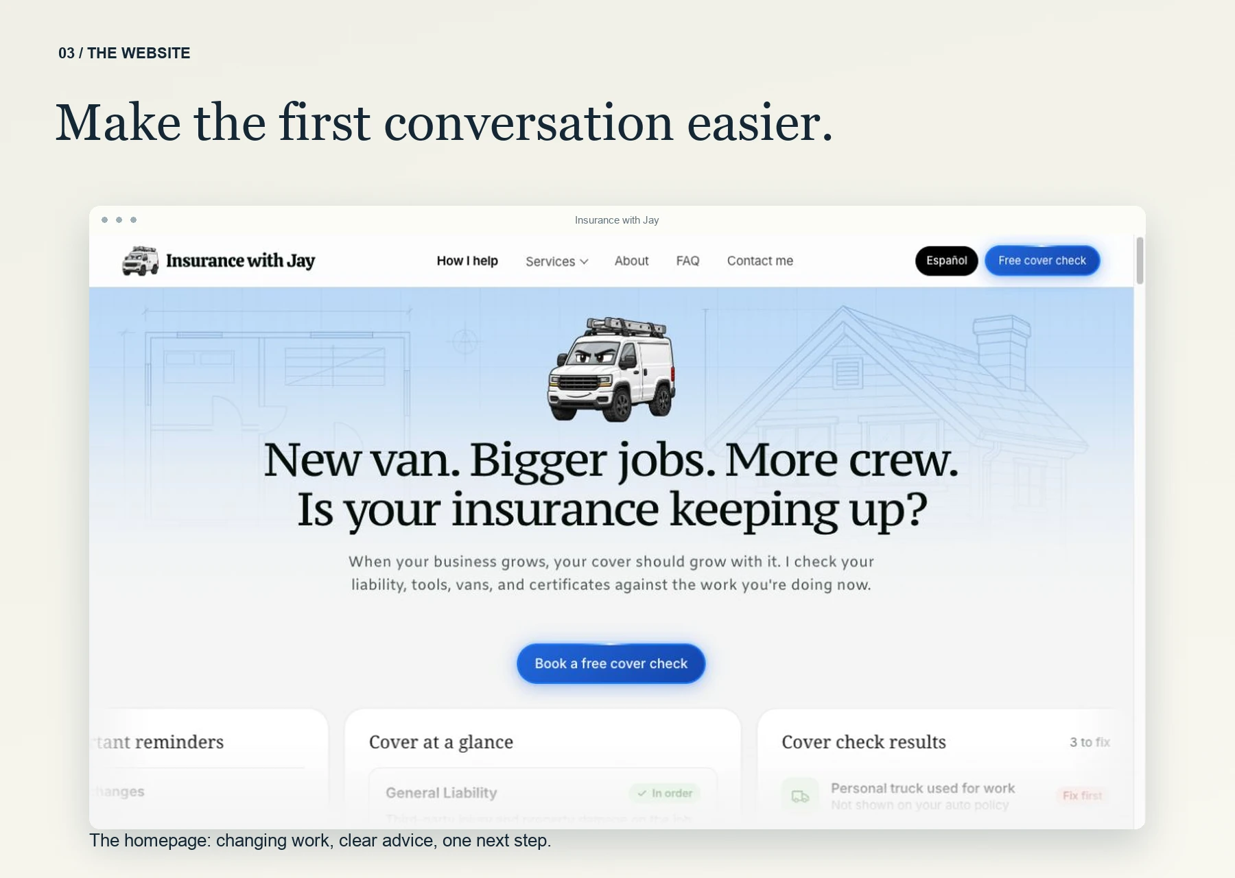
Show how Jay helps, before asking for an enquiry.
The homepage connects changes in a client’s business to the cover they may need to review. Illustrated interface examples bring certificates, tools schedules, renewals, and conversations with Jay into view. These are explanatory website visuals rather than a customer portal. Service sections, Jay’s story, and a Check → Quote → Cover sequence give visitors context before inviting them to book a free cover check.
05 The trades
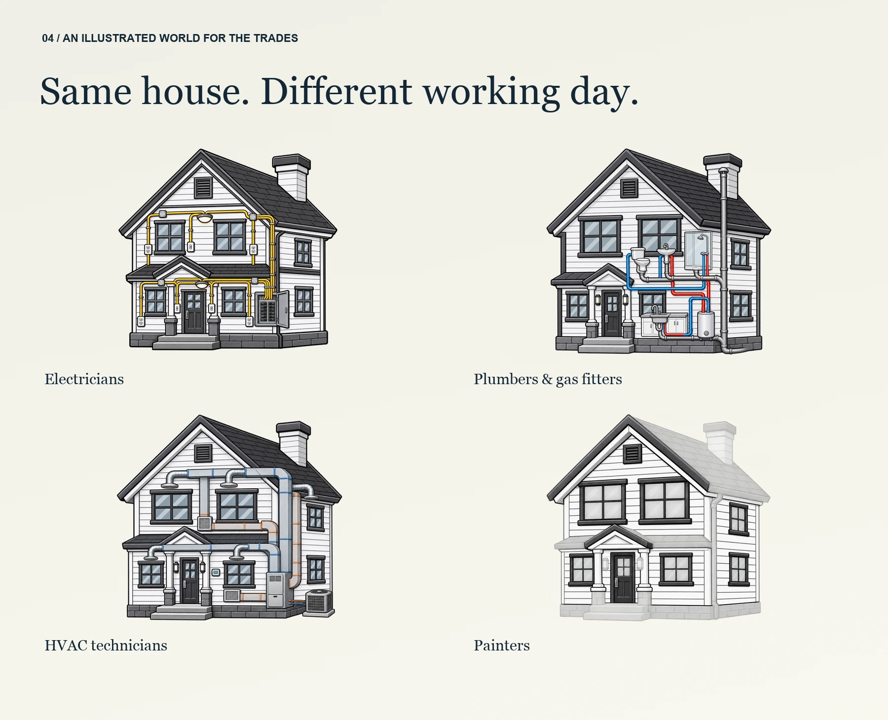
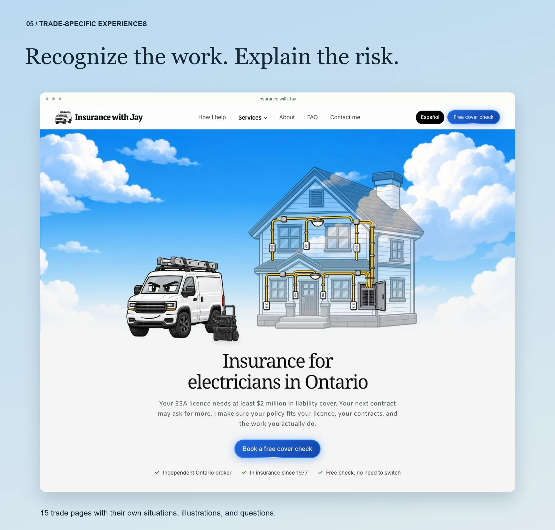
Fifteen trades. Fifteen specific conversations.
The site includes dedicated pages for electricians, plumbers and gas fitters, HVAC technicians, roofers, carpenters, framers, painters, drywall contractors, siding installers, concrete contractors, window installers, pressure washing businesses, cleaning companies, landscapers, and general contractors. Each page connects its trade to recognizable situations, relevant coverage questions, FAQs, and a direct next step. The illustrated house changes to show the work, making the same visual system useful across different audiences.
06 The experience
A clear route from interest to conversation.
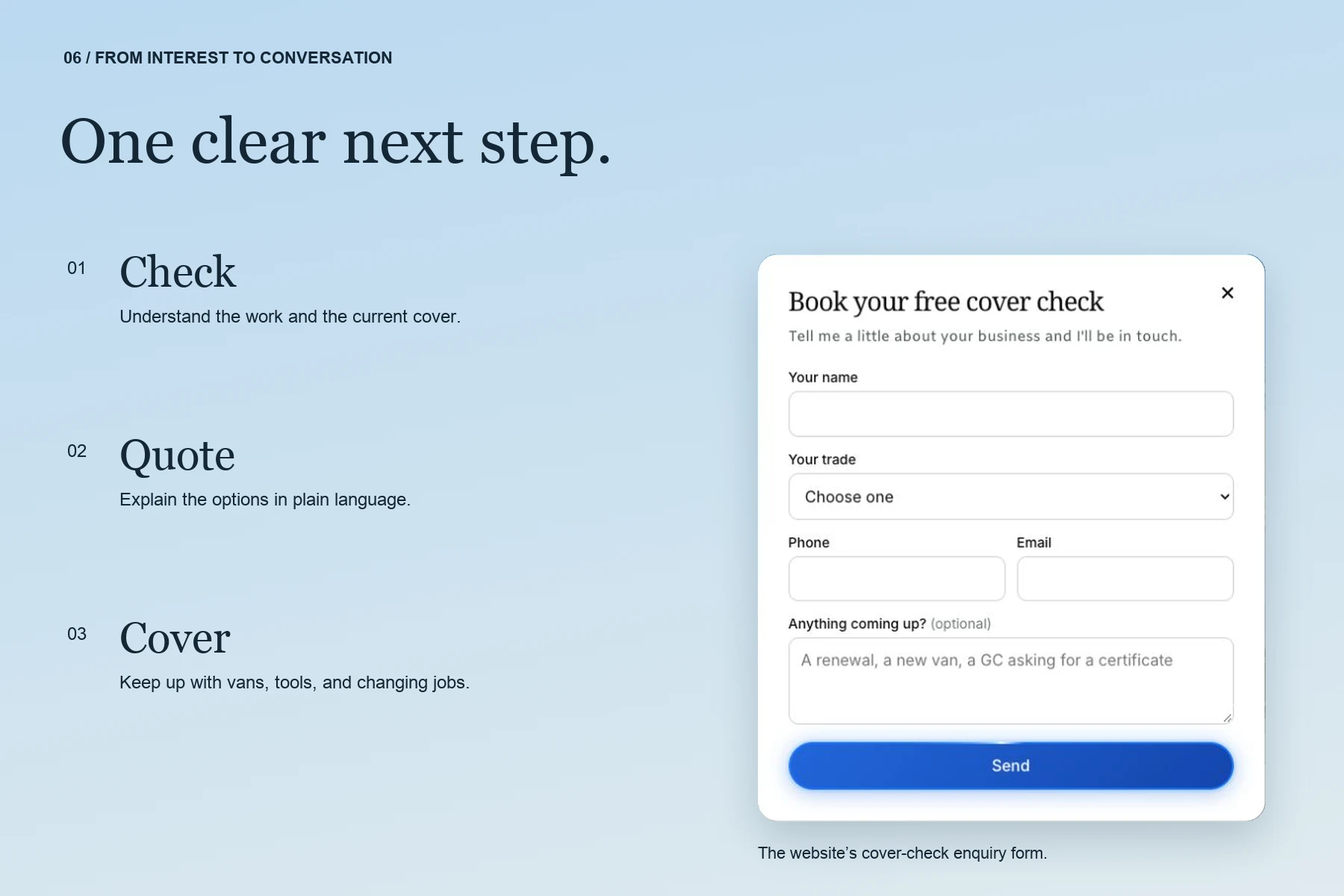
English and Spanish versions carry the experience across languages. The cover-check form asks for a name, trade, phone number, email, and an optional note about upcoming work, giving Jay context for the follow-up. Personal insurance, contact, about, and FAQ pages round out the experience. The website introduces the service and gathers enquiries; the insurance review itself remains a conversation with Jay.
07 What’s next
A brand that can keep showing up.
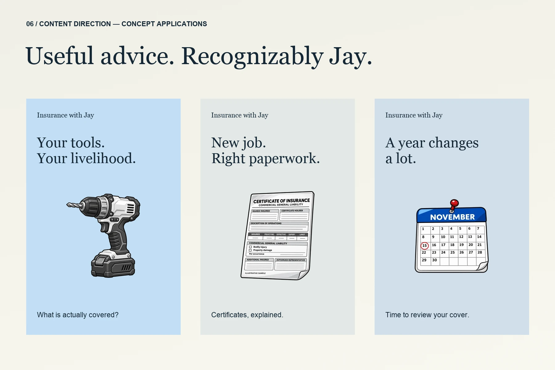
The next stage is a recurring content series built from everyday questions: what happens to tools in a stolen van, what a new contract asks for, and what should change at renewal. The illustration library gives those topics a consistent visual language, with the van available as a recurring guide. These social applications are concepts for the next phase; the current work establishes the identity, website, and artwork they can grow from.
Project scope & status
The foundation, built together.
- Positioning and copy centered on Ontario’s trades and Jay’s personal service.
- A coordinated identity, lead mascot, supporting characters, and trade illustration library.
- An English / Spanish website with 15 trade pages and a focused enquiry path.
- A visual direction for future content. Brand development is ongoing; campaign performance is not yet measured.